
The Impact of Responsive Web Design on User Engagement.
In today's digital age, where the majority of internet users access websites through various devices, responsive web design has emerged as a crucial element for success. The shift toward mobile-first browsing has redefined user expectations, making it imperative for businesses to adapt. In this blog post, we will explore the profound impact of responsive web design on user engagement and why it's a game-changer for your online presence.
The Mobile-First Era:
The prevalence of mobile devices in our lives is undeniable. With smartphones and tablets becoming our primary means of accessing information, businesses must acknowledge this shift. According to Statista, in 2021, mobile devices accounted for over 50% of all web page views globally. This underscores the mobile-first era we are in.
Responsive Web Design Defined:
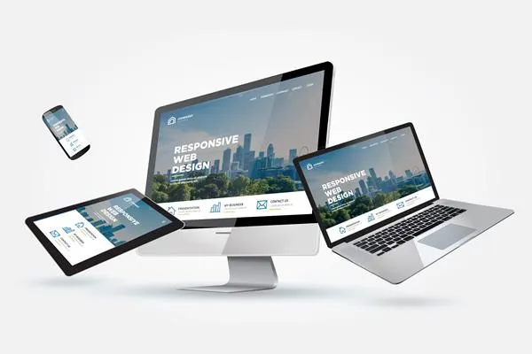
Responsive web design is a design approach that ensures websites adapt seamlessly to various screen sizes and devices. It achieves this by using flexible grids, media queries, and fluid layouts. The primary goal is to provide an optimal viewing and interaction experience across a wide range of devices, from large desktop monitors to small smartphone screens.
Enhancing User Experience:
Responsive web design significantly enhances user experience (UX). Users no longer need to pinch and zoom to view content or struggle with navigation on their mobile devices. A responsive website offers easy navigation, readability, and an overall pleasant experience, which translates into longer time spent on the site and reduced bounce rates.
SEO Benefits:
Responsive design goes hand in hand with search engine optimization (SEO). Google, the dominant search engine, has adopted a mobile-first indexing approach, meaning it primarily uses the mobile version of a site for ranking and indexing. A responsive website ensures a consistent URL structure, making it easier for search engines to crawl and index your content.
Boosting Conversion Rates:
Improved user experience and SEO also lead to higher conversion rates. Responsive design ensures that calls-to-action (CTAs) and forms are easily accessible and functional on all devices. Many businesses have reported significant boosts in conversions after implementing responsive design, as users find it easier to engage with their content and offerings.
Practical Implementation:
Implementing responsive web design requires careful planning and expertise. It involves designing and developing your website to adapt seamlessly to various screen sizes. There are many tools and frameworks available to aid in this process, such as Bootstrap and Foundation. However, it's essential to be aware of common challenges, such as image optimization and content prioritization, and how to overcome them.
Conclusion:
In a world where user engagement and online visibility are paramount, responsive web design is not just a trend; it's a necessity. It caters to the needs of an ever-growing mobile audience, enhances user experience, boosts SEO, and drives conversion rates. To succeed in the digital landscape, businesses must prioritize responsive design to ensure their websites work flawlessly across all devices.
Featured Services
Some of the things we do best.

Website Development
Our website development service is your gateway to a dynamic online presence.

Integrated CRM
We offer a custom CRM that will integrates with all of your online tools you already use.

E-Commerce Solutions
We work with the leading e-commerce platforms as well as custom developed solutions.
Office Locations
Philadelphia, PA
Marlton, NJ
Wildwood, NJ
Contact Us
We Deliver.
© 2026 Stork Technologies Corporation

info@storkcorp.com
(215) 515-5314
Philadelphia, PA
Marlton, NJ
Wildwood, NJ
© 2026 Stork Technologies Corporation